

Actually, the user interface is a very broad concept. This also involves the layout or translation of an entire app, but let's start with the arrangement of the record pages. For this, you have three main tools: Lightning Pages, Page Layouts, and Compact Layouts. The real instructional material can be found in the links at the end of this article. Here, I'm mainly sharing some experiences that I want to add to that study material.
Which one should you use?
Lightning Pages
Let's start with Lightning Pages. This is the most versatile tool to create and customize app- and record pages.
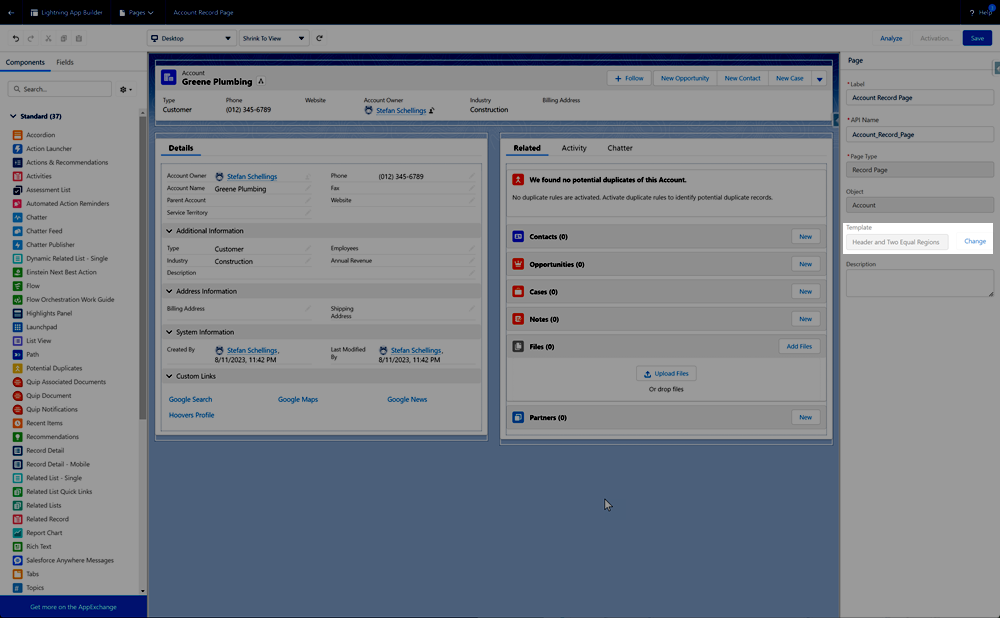
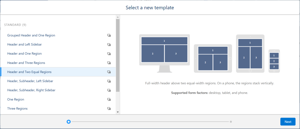
Template
For starters you can choose from a number of basic layouts for your page.
Strive to be consistent across your org or app. When for instance you always place Record Details on the left and Related Lists on the right, users will easily find their way anywhere.
Components
The most common components to use in pages are:
- Record Detail
- Related Lists
- Activity Timeline
- Chatter Feed
The importance of each of these four and whether they all occur at all varies per object. For some objects, such as Cases, the chatter feed and activity timeline (where tasks, appointments, and emails can be found) can be important, while these usually don't add much value for a Product.
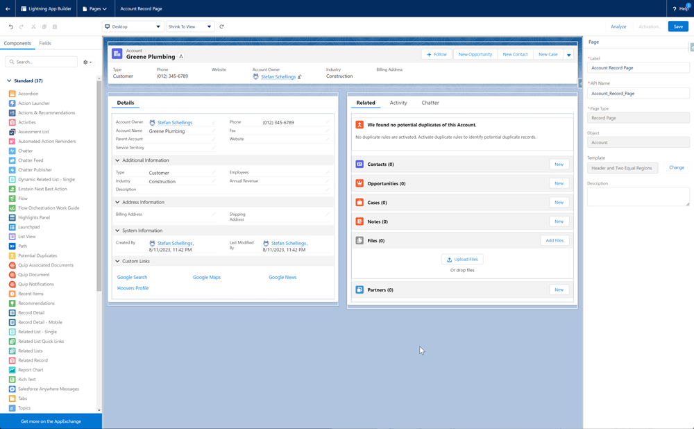
I always use the Header and Two Equal Regions layout, where I consistently place the Record Detail component in the left column and the Related Lists in the right column. Why 50:50? I find that for the Record Details, it is less comfortable to read when spread out over a wider width. And perhaps even more importantly, from a 50% width onwards, the advanced view for related lists becomes available, allowing you to display more than 4 columns.
Tabs & Accordeons
If you always use a two-column layout split 50:50 in width, you can also use Tabs (side by side) and Accordions (stacked) to show more on the page than just Details and Related Lists.
With Tabs, I make it a habit to use the component, even if a column has only one tab. This reduces the differences between pages that have extra tabs and those that don't, which enhances a consistent user experience.
Dynamic Actions
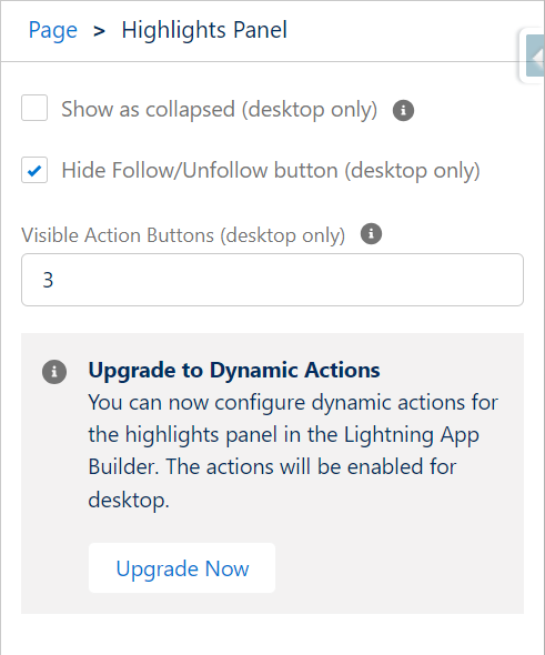
By upgrading the action buttons in the Highlights Panel to Dynamic Actions, you can directly add buttons and actions to the Lightning Page instead of doing this in the traditional Page Layout. You can also individually configure the visibility conditions for each button or action. These conditions can be field values on the record, but also the user's profile or – get creative – the day of the week. This way, you can keep the page clean for each user and hide everything they do not need at that moment.
Dynamic Forms
Dynamic Forms is the second dynamic feature that, along with the other two, could ultimately render the traditional Page Layout unnecessary. The feature has been around a few years already, but Dynamic Forms still is not available for all standard objects. Each release when I still miss the Dynamic Forms option for one of the important standard objects, this dissapoints me.
Just like with Dynamic Actions, you can set visibility filters on individual sections and fields, allowing you to control the visibility and editability of fields for a broad audience within one page, while with traditional page layouts, you have to struggle with a completely separate page for each record type and/or profile.
If you use an app mainly consisting of custom objects, I definitely recommend trying to control the layout for all record pages using Dynamic Forms rather than the classic Page Layout.
Dynamic Related Lists
Since the introduction of Dynamic Related Lists in the Summer '22 release, we now have the option to create filtered Related Lists. For example I could add separate Related Lists for active and closed Opportunities to an Account Page.
Whether you can use a related list in your Lightning Page still depends on whether you made it available by adding it in the old Page Layout assigned to the relevant profiles and record types.
Page Layouts
Page Layouts, as the platform has had for years even before the introduction of Lightning Experience, still cannot be completely disregard at the moment.
As mentioned before, this is where you determine the availability of specific Related Lists. Page Layouts especially made for Community Profiles, are also a quick way to easily control what a customer or partner user can see and edit in an Experience site.
Compact Layouts
With a Compact Layout, you select 1 to 5 fields that you consider the most important and that you want to show at a glance to your user. This compact layout is what you see in the Highlights Panel on the Lightning Record Page.
For records with a lot of fields on the page, such as Opportunities or Quotes, it is definitely worth making the core information quickly accessible in this way.
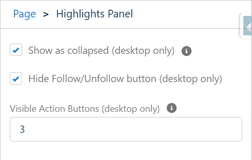
It is not for all objects that this feature has merit. For objects that have only a handful of fields on the page layout to begin with, it is best to select "Show as collapsed" to keep the page cleaner and more organized.
Getting Started
Managing the user interface is an activity that even a relatively inexperienced admin can handle quite well. You will not cause irreversible damage because you are not manipulating data with these configurations. Nevertheless, always use a sandbox, even for changes like these. You could inadvertently make fields or actions that people need unreachable. Plus, you could lose your carefully made customizations if you, a colleague, or a hired consultant later creates an edited version of the page, starting from a version that deviates from what you're working with in the live environment.
Get started with the documentation and exercises below.